Color Wheel and Color Palettes
by Haus of Blaylock
Creating the Perfect Color Palette
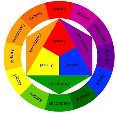
Let’s start with the Color Wheel. Sir Isaac Newton created the first color wheel in 1666 after discovering that pure white light contains a full spectrum of colors. Now, this color wheel is made of 12 different colors, each belonging to a particular color group depending on whether or not you can mix them together. You have the Primary colors (Red, Blue, Yellow) which are not mixed with another color. The Secondary colors (Orange, Purple, Green) are created from mixing the primary colors. And the Tertiary colors, which are created through the combination of mixing the primary and secondary colors. From there, you can lighten or darken a color depending on what neutral color you mix with it. Tinting (i.e., lightening) a color occurs by adding white. Shading (i.e., darkening) a color occurs by adding black. And Toning (i.e., slightly darkening) occurs by adding gray.
Types of Color Palettes
There are a lot of different types of color palettes, each based on the number of colors they used. There’s Monochromatic, which is based on a single color (tinting, shading, and toning are used a lot when creating a monochromatic color palette). Complimentary, which is based on two colors, each sitting opposite of one another on the color wheel. Split-Complimentary, where you use one color, then chose either of the shades that lay next to its opposite color. Triadic, which uses three colors, each with equal space between them on the color wheel. Analogous palettes are a bit more complex. It consists of two colors from the primary colors and the third being a mix of those two colors with a secondary color. One of the colors will be the dominant color, the second should support the dominant color, and the third color should be used for accents.
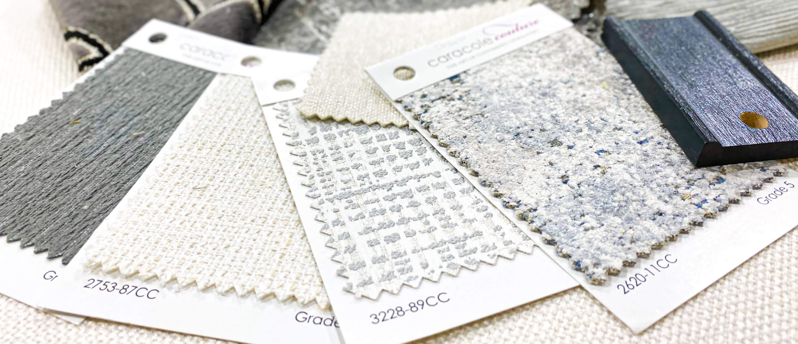
Now that we’ve covered all the bases, let’s take a look at one of my favorite designs. For this room, I used a monochromatic palette as well as using the tinting and shading method to create an array of different shades while also keeping the tone of the room the same. The accents of the room align with the color palette, however, by using a mix of different textures, I was able to bring some edge and depth back into the room!
Thanks for reading! Come back next Sunday to read my next blog post! And make sure to follow me on all my socials!
Didn’t get a chance to read last week’s blog post? No problem! Click here to read it now.


